It’s still not enough to just have open jobs and an obtuse company career page anymore as we have discussed before. With companies competing for the best hires, candidates expect more. A career page introduces candidates to your company, your values, and your mission. Give them a digital tour to inspire them!
A great career page is easy to navigate and has the right User Interface elements to direct candidates as where to apply. Not only that, but it should appeal to the type of candidate you’re looking to attract to your company. It’s an extension of your brand, so make it count.
Here are some more of our favorite career sites to inspire you on creating your own:
JEFFREYM
WHY WE LIKE IT:
Their messaging is all about being on the inside circle of their business. It’s a special club you get to be a part of. Add to that a clean and colorful presentation of job titles with locations, and you’ve got a great landing page for candidates to be drawn in, inspired, and ready to apply.
SQUARE
WHY WE LIKE IT:
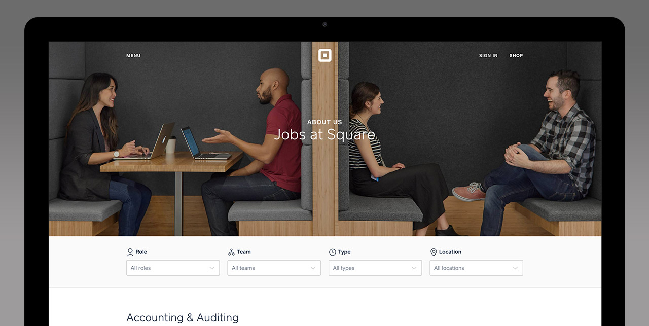
Just like Square’s attention to design around the site and their products, this career page is easy to read. The user interface and experience are priorities at Square, and this page exemplifies those values. The first image you see on the page represents the attitude they want you to expect at square: collaboration, fun, and diversity.
In that attention to detail, the jobs have four columns, and right above each column is a dropdown search field based on the column. Super cool.
ATLASSIAN
WHY WE LIKE IT:
Sometimes simple is all it takes to make the candidate experience easy. Almost like a funnel, the page goes from the job categorization to the job itself. In just two clicks, you’re ready to apply to the job you’re looking for. A small bit of the branding color helps to draw to the important components, and the use of whitespace helps with the focus as well.
SATMETRIX
WHY WE LIKE IT:
Not every page has to adhere to minimalism and a lack of detail. Instead, Satmetrix uses a bit of detail to add to the personality of the page without being too loud. It still draws the eye to the important parts, while highlighting the culture and attitude of the company. Plus, pictures of people doing things together on the page helps give a sense of what it will be like to be a part of that team.
VISA UNIVERSITY RECRUITING
WHY WE LIKE IT:
For this page, Visa utilized The SmartRecruiters Career Page Builder. It enables their team to create and change career pages with minimal IT resources. It’s on brand, and more importantly, on schedule.
It starts with an image of what the office looks like, plus imagery of people working there. It’s almost like you’re getting a mini-tour of the office while you learn about what job opportunities there are.
OppenheimerFunds
WHY WE LIKE IT:
Oppenheimer also utilizes The SmartRecruiters Career Page Builder. The difference here is that they have a hybrid method: not only have they leveraged their IT resources to build a careers landing page, but it pops out to a SmartRecruiters hosted page that can be edited by the recruiting team when they need. It meets the needs of a detailed brand, while still allowing the recruiters to be nimble.
An excellent career page allows you to exhibit yourself as the ideal place to work. Candidates want to see more than a list of jobs, they want to see a company and career they want to be aligned with. If your career page doesn’t treat talent acquisition as a marketing function, you might be losing the best candidates to your competition. Don’t let that happen! Spend some time crafting the right experience for your candidates to guide them to their new career.

